Reveal: case study blog task
Media language
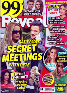
1) How many of the 12 magazine cover key conventions feature on this edition of Reveal? List them with specific reference to the convention on the CSP edition of Reveal.Cover lines: such as 'STUFF THE DIET' which tries to give the reader more information abut the image.
Colour scheme: such as white which could connote that it pure and clean and yellow which could connote that it stands out and black to connote that the important information (price) is more bolder than the rest of the information.
2) What is the font choice used on the cover and what does this choice connote? Here's a blog to help you with this as we haven't been able to complete the Photoshop typography lesson yet due to Covid-19.
4) What are the connotations of the Reveal colour scheme on this particular front cover?
5) How are images used to create interest in the magazine? Find three reasons for your answer. (E.g. mise-en-scene such as props, costume and make-up, body position, facial expression).
Language: such as the tag lines around the Reveal magazine. For example 'BLOOMING BABY BUMPS' which could connote that the language used for that tag line would be targeting women's. egtu
2) What is the font choice used on the cover and what does this choice connote? Here's a blog to help you with this as we haven't been able to complete the Photoshop typography lesson yet due to Covid-19.
The font choice used on the Reveal magazine is sans serif which would connote that this magazine is for the lower class people because serif is a posh way of writing with spikes hanging out from the corners of each letters which would connote that it's more better and high quality and would be targeted at the higher class people also you can tell that the Reveal magazine is for the lower class people because it say's at the top left corner in BOLD writing 99p.
3) How do the cover lines appeal to the Reveal target audience?
3) How do the cover lines appeal to the Reveal target audience?
The cover lines surrounding the Reveal magazine show's mainly women's also the tag lines are mainly women based which would connote that the target audience that Reveal would be trying to target would be women's. Furthermore, the central image show's Katie and Pete and then the cover line saying 'KATIE PLOTS SECRET MEETINGS WITH PETE' which could connote that the age genre that Reveal could be trying to target are certain types of women's aged around 24 to 28 because Katie and Pete used to date which would mean women's around the ages 24 to 28 would be dating.
4) What are the connotations of the Reveal colour scheme on this particular front cover?
The colour's that are popping out from the magazine is mainly yellow which could connote that the Reveal magazine are trying to make people read the cover lines which are in yellow because they are brighter than the rest. There is also pink which could connote that it's a dreamy colour because the tag line surrounding the pink is 'CHERYL Becomes a very posh mum' which could make women wonder how having a baby would feel like.
5) How are images used to create interest in the magazine? Find three reasons for your answer. (E.g. mise-en-scene such as props, costume and make-up, body position, facial expression).
The central
6) What differences can you find between the use of design and typography between Tatler and Reveal? List at least three and explain the effect on audiences.
Representations
1) What type of celebrities appear on the front cover? How are they represented in Reveal? (Positive? Negative? Reinforcing or challenging stereotypes?)
2) How are women represented on the cover of Reveal? Think about both images and cover lines here.
3) How do Reveal and Tatler represent social class? (E.g. middle/upper class and working class)
4) What would be the preferred and oppositional readings to this cover of Reveal?
Social and cultural context
1) What aspects of British life are reflected in Reveal? How does this compare to Tatler?
2) What do the cover lines in Reveal suggest about the issues and lifestyle of Reveal readers?
3) Find three other front covers for Reveal. What issues or features regularly appear in Reveal?


Comments
Post a Comment