Tatler CSP case study
1) Look at the Tatler Media Pack. Go to page 2: how does the editor introduce the magazine? The editor introduces the magazine by saying positive things about it so that it grips the readers intention and then says some more positive things about it so that the editor can reel the reader in so the reader can buy the magazine I read it.
2) Now go to page 4 of the Media Pack. Focus on the print magazine (NOT tatler.com - the website). List the key demographic details: age, gender %, ABC1 % (social class), HHI (Household Income), % of those living in London and the South East. What do these demographic details suggest about the average Tatler reader?Tatler is for women mostly women because the percentage of it is 73% also the ae group for Tatler is around 41. For ABC1 it shows that it's 83%. However, for HHI it's £261,572 but for for those living in London and the South East it is 70%.
3) Look at page 6. What do Tatler readers think about fashion? How much do they spend?
It connotes that £843 million spent on fashion in the past year and that 93% of Tatler.com users own designer fashion.Furthermore this can help to persuade Tatler readers to buy there clothes because it shows figures of what other people think of Tatler.
4) Go to page 10. What are the special editions of Tatler that run throughout the year? What does this suggest about the Tatler audience? What about the pyschographic audience group that best fits Tatler?
That there are ONLY 6 special editions on certain types of months during the year. For example, the Travel Guide edition came out in January whereas for the second edition Wedding Guide that came out in March which could connote for the Tatler audience that they like those certain months because of Tatler releasing new editions on those months.
Media language
Revise the 12 magazine cover key conventions and check how many feature on this edition of Tatler.
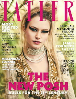
1) What different examples of typography can you find on the cover of Tatler? What are the connotations of the serif and sans serif fonts? Here's a blog to help you with this as we haven't been able to complete the Photoshop typography lesson yet due to Covid-19.
2) How do the cover lines appeal to the Tatler target audience?
Media language

Revise the 12 magazine cover key conventions and check how many feature on this edition of Tatler.
1) What different examples of typography can you find on the cover of Tatler? What are the connotations of the serif and sans serif fonts? Here's a blog to help you with this as we haven't been able to complete the Photoshop typography lesson yet due to Covid-19.
That for sans it's normal writing which connotes it's not that much good in quality however for serif it has a pointy isosceles on the end of every word which connotes that it's much more better in quality and that it's for higher class people but for sans it connotes it's for lower class people.
Text placed around the image telling the reader what is going to be
in the magazine (stories). Usually, there will be one larger ‘flash’ and a series of smaller cover lines.
The main flash will often be placed in the bottom left quarter of the cover and frequently connects
with the central image. This is an example of a ‘key convention’ – a common feature recognised by
the audience.
3) What are the connotations of the Tatler colour scheme on this particular front cover?
That it is mostly in pink which could connote that it's for girls because of the central image also there is black because it could be to make the facts look bold and stick out more from the rest. There is also white which could connote that they are pure and clean.
4) How is the central image designed to create interest in the magazine? Find three reasons for your answer. (E.g. Mise-en-scene such as props, costume and make-up, body position, facial expression)
4) How is the central image designed to create interest in the magazine? Find three reasons for your answer. (E.g. Mise-en-scene such as props, costume and make-up, body position, facial expression)
The central image is designed to create interest because it shows a women who is all dolled up which could connote that women's like to look good and pretty before they have a photo shoot. Also it shows the women wearing rich material on her clothes which could connote that women like to make there body figure look good for the camera also it could help to show more understanding because of the cover lines around the central image. Lastly, the women's hair is all a mess which could connote that for the main cover line 'THE NEW POSH' could show that this is the new trend which would reel women into doing the same.
Representations
1) What different groups of people are represented on the cover? (E.g. men/women/white people etc. Look at the image and text/cover lines to help here)
Representations
1) What different groups of people are represented on the cover? (E.g. men/women/white people etc. Look at the image and text/cover lines to help here)
That the central image is a white women who is posing for a shot and that the cover lines are there to make the readers read it to get more interested into the magazine by saying famous peoples names. For example, James Corden.
2) What do the cover lines suggest about the lifestyle of rich people in the UK?
That they are known by the public well and that the public know about there lifestyle which could connote that nothing goes missed by these celebrities.
That they are known by the public well and that the public know about there lifestyle which could connote that nothing goes missed by these celebrities.
3) Are there any stereotypes being reinforced or subverted? How? Why?
I am not sure.
4) What would be the preferred and oppositional readings to this cover of Tatler?
The oppositional reading for the cover of the Tatler magazine would be that it is mainly about womens and that the men's could get offended because the central image is a women and that the cover lines around the central image is mainly about clothes and make up.
Social and cultural context
1) What aspects of British life or people are NOT reflected in Tatler? (Watch the clip above again if you need help with this - the clue is in the title 'Posh People')
Social and cultural context
1) What aspects of British life or people are NOT reflected in Tatler? (Watch the clip above again if you need help with this - the clue is in the title 'Posh People')
Tatler just talks about the lives of the upper class people and it doesn't talk about the lives of the people who are living in the lower class or the way's that they live there lives.
2) Tatler runs special issues on holidays, spa breaks, cosmetic surgery, watches and jewellery and private schools. What does this suggest about the magazine's representation of life in Britain?
2) Tatler runs special issues on holidays, spa breaks, cosmetic surgery, watches and jewellery and private schools. What does this suggest about the magazine's representation of life in Britain?
The Tatler magazine connotes that Britain is a developed country filled with a lot of expensive and high quality stuff but which is not all entirely true because if so then there wouldn't be a lower class for the people in Britain and that everybody that did live in Britain would be all in the upper class section.
3) What audience groups might be offended or insulted by the front cover of Tatler April 2017?
The audience groups that would be offended would be the lower class men because everything on the Tatler magazine is mainly targeted at women's and not men also some women's could be offended at the Tatler magazine because the central image is a women who is all filled with makeup and and expensive clothes which could connote that all women's like too look pretty and all they like is to wear clothes.
4) Find three other front covers for Tatler from different months. What issues, subjects or people are regularly featured in Tatler?
4) Find three other front covers for Tatler from different months. What issues, subjects or people are regularly featured in Tatler?
The three main subject that Tatler like to target are women's, make up and clothes.


Comments
Post a Comment